

The Pareto Principle, also called the 80/20 rule, suggests that 20 percent of the causes lead to 80 percent of the effects. It is also called the law of the vital few: The vital few inputs drive most of the outputs.
The Pareto principle was first coined by a consultant by the name of Joseph Juran. Joseph Juran named the principle after an Italian economist Vilfredo Pareto who wrote that 20% of the nation’s people owned 80% of its land.
Since then, Pareto’s law has become quite common in various aspects of life and business. It is often stated that 80% of sales from 20 percent of customers for a business.
The 80-20 rule is a critical tool to use for lean six sigma projects as it commonly applies that a vital few (20) inputs create more impact than all the other inputs (80). Therefore, if we can identify the vital few inputs we can narrow the focus of the project to the vital few 20% that cause 80% of the problems.
What is a Pareto chart?
The Pareto principle is best displayed using a Pareto chart, which is a graphical representation of data in a bar chart form with a line graph counting the cumulative percentage of the inputs or causes being measured.
An example of a Pareto chart can be seen below. This Pareto chart is showing all the reasons for line stoppages. From left to right in order of highest to lowest frequency are the categories of reasons the Line has stopped. The cause of 80% of line stoppages appears to be three due to three issues, Turntable, Blocker Alignment and Foil Dispenser. The other four categories around for around the remaining 20%.

As the bar chart shows the percentage of each category, the black line from bottom left to top right shows the accumulative percentage. Therefore, to identify where 80% of the problem comes from we can run a straight line from 80% to where it intersects the Pareto line and continue 90 degrees down.
What’s the difference between a Pareto chart and a bar chart?
Pareto charts and bar charts can look similar, but both have their own use. Bar charts can sort the ordinal data from highest frequency to lowest frequency. But the difference with a Pareto chart is it has a second Y Axis on the right-hand side that accounts for the cumulative frequency.
The bar chart can help with the analysis of the top causes but will not show you how many of the top causes to focus on to address 80% of the causes whereas, the Pareto chart does this effectively.
When to use a Pareto chart
The Pareto chart is a useful root cause analysis tool to use when you have data to analyse and evidence the top 80% of causes of a problem to provide focus to the project team and demonstrate with data the area to focus on rather than using feeling or emotions to make decisions which could lead the project team to focus on smaller of non-existent causes of the problem.
Pareto Analysis Example
Pareto’s can be used for a range of scenarios of issue prioritisation. Take the example below which looks to prioritise customer complaints in relation to a customer service phone line. By collecting the data and analysing it with a Pareto chart, we can interpret that just over 80% of customer complaints are due to the top two categories of customer service not helpful and too long on hold. This allows for the project team to focus on those two areas which are the vital few 20% that are causing 80% of problems.

Customer service is not helpful – Likely further data collection would be needed to understand this further, but it could case of better training is needed to improve customer service knowledge.
Too long on hold – Could review the times of day where excessive phone call hold times are and address the number of phone operators available at peak times.
How to create a Pareto chart
To create a Pareto chart, you don’t need special statistical software like Minitab or JMP. They can be generated in a recent version of Microsoft Excel.
However, we would also suggest considering our online Pareto Chart Creator which allows you to create Pareto charts and export them in sections.
This can be done by following the following steps:
- Create a table with column titles: Categories, frequency, cumulative frequency and percent

2. List the categories in the first column

3. Input the frequency into the second column

4. Calculate the cumulative frequency in the third column, row one being =B2, row two being =B2+B3, row three being =B3+B4 and so on.
You should have something like the one below with the number increasing.

5. In the percent column calculate the percent of each category against the total. E.g. =B2/C14. This formula should be the frequency number divided by the total number from the cumulative frequency.

6. Now select the Categories and percent column and click insert, Recommended Charts, you should then have a screen like below, select Pareto and click Ok.

If you had any difficulties following these steps, don’t worry we got you covered with a free template of a Pareto in Excel below. However, it is useful to understand how these are created.
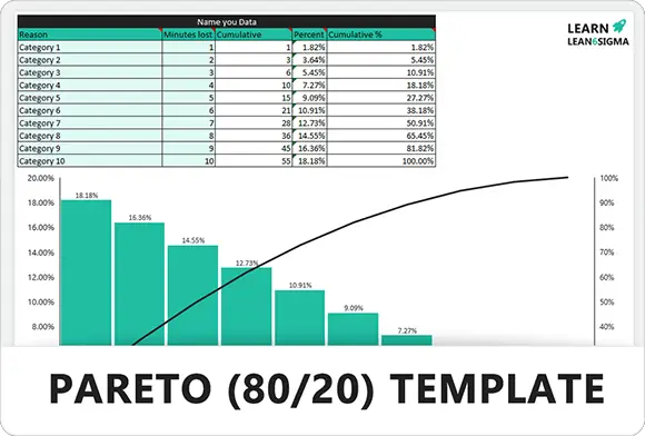
Pareto Chart Template – Excel
Download the free Pareto chart excel template, all you need to do is input your data and the formulas will automatically calculate the percentages and produce the Pareto analysis.
Conclusion
In conclusion, Pareto’s are a great tool for identifying the vital few inputs or causes according to Pareto’s law (the 80-20 rule). Using the Pareto allows for focus on 2 or 3 categories that will address 80% of the problem with 20% of the effort narrowing the project scope. Pareto’s are also great for communicating to the project team where the focus should be based on data.
What’s Next
After mastering Pareto Diagrams is time to focus on using histograms to analyse and interpret data in lean six sigma projects. Find out more about histograms.